Commercial Poolside Furniture Color Selection: How To Match Your Property’s Brand Identity
Quick Summary
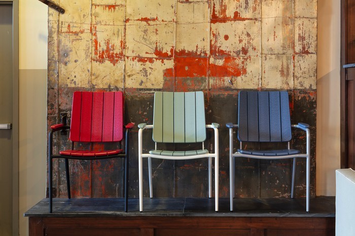
Poolside furniture color directly affects how guests perceive a property, both in person and in social media photos. Neutral tones blend easily with existing design and age gracefully, while bolder colors reinforce a distinct brand personality. Darker shades hide daily wear better, and lighter tones reflect heat more effectively during peak sun hours. Choosing colors that stay available for future reorders helps properties avoid mismatched furniture when replacing pieces in phases.
A pool deck says a lot about a property before a guest ever checks in. The colors, finishes, and overall look set expectations the moment someone walks outside. Commercial poolside furniture plays a bigger role in that first impression than most properties realize when they start planning a renovation or new build.
At Resort Contract Furnishings, we talk with hospitality buyers who often focus on comfort and durability first, then realize color choice needs just as much thought. Getting it wrong can make a newly renovated pool deck look mismatched against the rest of the property within a season.
Why Commercial Poolside Furniture Color Matters for Brand Identity
Color does more than match a design mood board. It connects a pool deck visually to a lobby, a restaurant, or a resort’s overall aesthetic. A property with a coastal, relaxed brand feel might lean toward soft blues and natural tones. A modern boutique hotel might use bold contrasts or monochrome palettes instead.
A few practical points worth considering:
- Brand consistency: Furniture color should echo tones already present in signage, uniforms, or interior design
- Photo appeal: Guests photograph pool areas constantly, and color choices affect how those images look on social media
- Seasonal relevance: Some colors show wear or fading faster depending on climate and sun exposure
- Guest perception: Color influences whether a space feels upscale, casual, playful, or formal
Properties exploring commercial poolside furniture options often start with a color palette pulled directly from existing branding materials. This can help keep decisions grounded instead of picking shades in isolation.
Matching Furniture Tones to Existing Property Design
A pool deck rarely exists on its own. It sits next to a building facade, connects to a lobby entrance, or borders landscaping with its own color palette. Furniture that ignores those surroundings can look out of place even if each piece looks good individually.
Neutral tones like white, gray, and taupe work well for properties wanting furniture that blends into multiple design styles over time. These shades also age gracefully, since minor fading is less noticeable compared to bold or dark colors under direct sun.
Bolder colors can work too, especially for properties with a distinct brand personality. A resort with a tropical theme might use vibrant blues or greens to reinforce that identity. A high-end urban hotel might choose black or charcoal frames paired with white cushions for a cleaner, more polished look.
Umbrellas and shade structures deserve attention in this planning too. Properties often pair their seating palette with coordinating shade options, browsing umbrella and weight styles that complement the furniture rather than compete with it visually. A mismatched umbrella can quickly throw off an otherwise well-planned color scheme.
Balancing Trends With Long-Term Durability
Trendy colors come and go. A shade that feels current this year might look dated in five years, and outdoor furniture is a longer-term investment than most interior decor choices. Properties benefit from balancing a current design trend with a color choice that holds up over time, both visually and physically.
Darker colors hide dirt and minor scuffs better in high-traffic areas, which matters near pools where sunscreen and splashing happen constantly. Lighter colors show stains sooner but often reflect heat better, keeping cushions and frames cooler to the touch during peak sun hours.
Fabric and cushion colors need separate consideration from frame colors. Solution-dyed fabrics resist fading better than standard dyed fabrics, so a bold cushion color has a better chance of holding its tone through multiple seasons if the fabric type supports it.
Properties updating furniture in phases, rather than all at once, benefit from choosing a color palette that stays available across multiple orders. Discontinued shades can create mismatched furniture down the line if a property needs to replace pieces gradually instead of replacing an entire pool deck in one order.
Practical Steps for Choosing Poolside Furniture Colors
Color decisions get easier with a clear process, not by picking shades based on preference alone. A simple approach works for most properties:
- Start with brand colors: Pull two or three core tones from existing branding, signage, or interior design
- Consider the climate: Account for sun exposure and heat when choosing between light and dark tones
- Test small before committing: Order a sample piece or swatch before finalizing a full pool deck order
- Plan for phased replacement: Choose colors likely to stay available for future reorders or repairs
Walking through these steps before placing a large order helps avoid costly changes after furniture arrives and gets installed.
Bringing Your Pool Deck Vision Together
Color selection for poolside furniture connects directly to how guests perceive a property, both in person and in photos shared online. Matching furniture tones to existing branding, balancing trends with durability, and planning for future reorders all play a part in getting this right.
A pool deck that feels cohesive with the rest of the property creates a stronger first impression than one that looks like an afterthought. Planning a color scheme for your next furniture order and want input on options that fit your brand? Talk with our team about what would work best for your space.
FAQs
Should poolside furniture match hotel branding exactly?
It doesn’t need to match exactly, but pulling from existing brand colors creates a cohesive look. Two or three core tones from signage or interior design usually work well as a starting point.
Do darker or lighter furniture colors last longer outdoors?
Both hold up well with proper materials, but they show wear differently. Darker tones hide scuffs and stains better, while lighter tones reflect heat and stay cooler in direct sun.
Can furniture colors affect how a pool area looks in photos?
Yes. Guests often photograph pool areas, and color choices influence how those images appear on social media. Cohesive palettes tend to photograph better than mismatched combinations.
What’s the risk of choosing trendy furniture colors?
Trendy shades can look dated within a few years, and outdoor furniture is a long-term investment. Balancing current design trends with timeless tones helps furniture stay relevant longer.
Why does color availability matter for phased furniture orders?
Properties often replace furniture in stages rather than all at once. Choosing colors that remain available for future orders prevents mismatched pieces when replacing worn furniture over time.